
Web Design + Mobile Websites = WEB SUCCESS!!!

Web Design Denver - The future of search is mobile, and the future is now!
An increasing number of your customers are using their mobile phones to find products and services. In fact…
 70 million Americans and 58 million Europeans browse websites from their phone every month
It’s predicted that by next year, more people will be using their mobile devices to surf the web than PC’s and Laptops
94% of mobile users use their mobile devices to search for local information, products, and services
In other words, there are a LOT of people using their mobile phone to search the web and most of them are searching for places to go and stuff to buy.

If your website is not easy to navigate from a smartphone, your customers will simply move on to one that is. If you want to remain competitive, having a mobile website is mandatory.
The future of search is mobile, and the future is happening right NOW. Let’s get started creating your mobile website today. (Contact info) *Or, add a Get Started button here.
What is the difference?
Understanding the difference between a regular website and a mobile optimized website
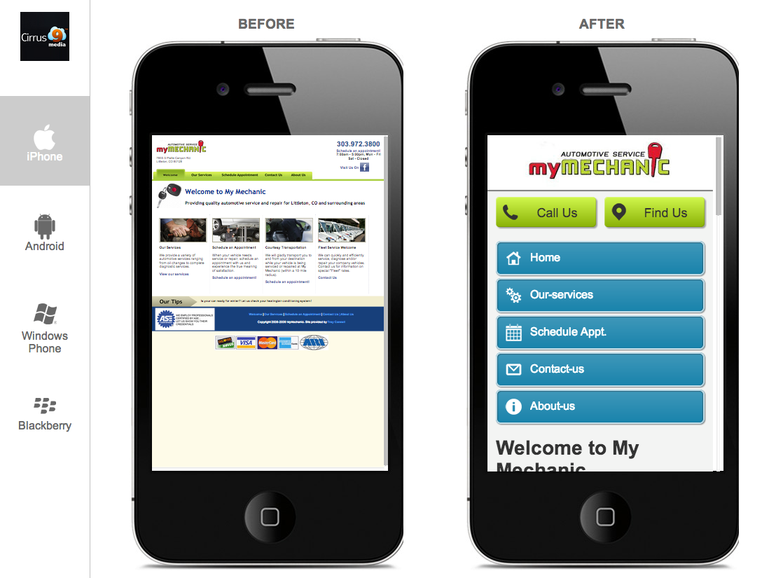
A regular website is usually designed for viewing on a desktop computer. When viewed on a smaller mobile device, the user experience can be clunky and frustrating.
Mobile-optimized sites solve this problem by creating a version of the website that is specifically designed to look great on all mobile phones. It’s simply a smartphone-friendly version of your website.
Your mobile site will have large easy to tap buttons, and content that is formatted to fit correctly on a mobile screen. This way your customers don’t have to pinch and zoom to find what they’re looking for. In addition, your mobile website may include features that take advantage of the advanced capabilities of a mobile phone such as a click-to-call button that, when clicked, places a call.
Your new mobile site will:
- Display automatically when someone tries to access your website from a smartphone
- Sync to your existing website and automatically be compatible with all smartphones including the iPhone, Android and Windows Mobile
- Make your website more engaging and easier to navigate for mobile users
- Increase the number of calls to your business
- Increase in-store traffic
- Gain insights into who is visiting your site
- Ensure maximize exposure to all mobile users
With so many of your customers using their phones to find products and services, this is a market you can’t afford to ignore! Commit to creating a great mobile experience for your customers with our mobile web design Denver packages.